Modular WordPress Components with ACF and AEM Concepts
This guide is about building flexible, reusable components in WordPress using Advanced Custom Fields (ACF), with some helpful ideas borrowed from Adobe Experience Manager (AEM). While WordPress and AEM are very different platforms, AEM’s component-based approach can inspire a cleaner, more modular way to structure content in WordPress.
If you are working on custom themes or building out content blocks for editors, this approach can help make things easier to manage—for both developers and content teams.
Why Choose Pure HTML, CSS, and JS?
Using just HTML, CSS, and JS to build from Figma designs keeps things simple and maintainable—especially for small teams or solo devs.
Ask yourself:
- Do you really need a library, or can native code handle it?
- Can fresher or junior-level dev maintain this easily?
- Is the code clean and reusable for future components?
Sometimes, less is more—especially when it comes to keeping things understandable and lightweight.
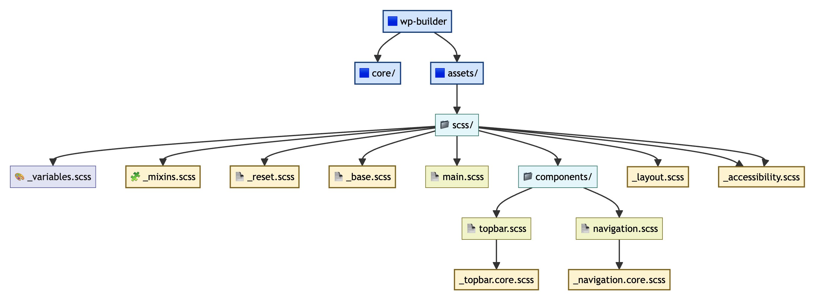
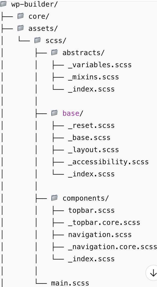
Here is a simple way to organize your SCSS project using @use and @forward, based on the files shown above. We will adjust the structure a bit to make use of _index.scss files.
main.scss
So, in reality, the main.scss here can be replaced by frontend.scss or editor.scss to support viewing isolated components in Author Mode (editor) or Public Mode (frontend).
@use 'abstracts';
@use 'base';

html, body {
  // global styles here
}

// grid and layout helpers
.wp-row {
  // ...
}abstracts/_variables.scss
When working in pure CSS, you define your design tokens as CSS variables inside the :root selector like this:
:root {
    /** Start _layout.scss */
    --container-max-width: 1200px;

    /* Spacing */
    --spacing-xxs: 4px;
    --spacing-xs: 8px;
    --spacing-sm: 16px;
    --spacing-md: 24px;
    --spacing-lg: 30px;
    --spacing-xl: 45px;
    --spacing-2xl: 60px;

}When working with Sass (_variables.scss), you define the same values as Sass variables like this:
// === Layout Variables ===
$container-max-width: 1200px;

// === Spacing Variables ===
$spacing-xxs: 4px;
$spacing-xs: 8px;
$spacing-sm: 16px;
$spacing-md: 24px;
$spacing-lg: 30px;
$spacing-xl: 45px;
$spacing-2xl: 60px;abstracts/_mixins.scss
You can’t define mixins in pure CSS inside :root — CSS does not support mixins like Sass does.
:root {
  --mixin-text-regular-font: 'Public Sans', sans-serif;
  --mixin-text-regular-size: 16px;
  --mixin-text-regular-line-height: 1.5;

  --mixin-container-padding: 0 24px;
  --mixin-container-max-width: 1200px;
}

.text-regular {
  font-family: var(--mixin-text-regular-font);
  font-size: var(--mixin-text-regular-size);
  line-height: var(--mixin-text-regular-line-height);
}

.container {
  padding: var(--mixin-container-padding);
  max-width: var(--mixin-container-max-width);
  margin-inline: auto;
}
Now, to bring that idea over into SCSS as proper mixins, you can define them like this:
@mixin text-regular {
  font-family: 'Public Sans', sans-serif;
  font-size: 16px;
  line-height: 1.5;
}

@mixin container {
  padding: 0 24px;
  max-width: 1200px;
  margin-inline: auto;
}Then in your components:
.header {
  @include container;
}

.paragraph {
  @include text-regular;
}abstracts/_index.scss
Using @forward is preferred over @import (which is deprecated in modern Sass) because it supports name-spacing and better dependency control.
@forward 'variables';
@forward 'mixins';base/_reset.scss
You don’t have to go overboard — just reset the stuff that causes problems, or use a light touch with something like normalize.css if you prefer.
*,
*::before,
*::after {
  margin: 0;
  padding: 0;
  box-sizing: border-box;
}base/_base.scss
Give basic HTML elements like body, headings, links, and buttons some consistent styling.
html, body {
  height: 100%;
  font-size: 100%;
  line-height: 1.5;
  font-family: sans-serif;
}

img,
picture,
video,
canvas,
svg {
  display: block;
  max-width: 100%;
  height: auto;
}

input,
button,
textarea,
select {
  font: inherit;
  color: inherit;
}

a {
  text-decoration: none;
  color: inherit;
}base/_layout.scss
Let keeps your layout stuff (like containers and grids) in one place, so you don’t have to repeat it everywhere.
$container-max-width: 1200px;

$spacing-xxs: 4px;
$spacing-xs: 8px;
$spacing-sm: 16px;
$spacing-md: 24px;
$spacing-lg: 30px;
$spacing-xl: 45px;
$spacing-2xl: 60px;

$border-radius-xs: 2px;
$border-radius-sm: 4px;
$border-radius-md: 8px;
$border-radius-lg: 16px;
$border-radius-full: 999px;

$breakpoint-xs: 480px; // iPhones and small phones
$breakpoint-sm: 767px; // Android phones, larger iPhones
$breakpoint-md: 1024px; // Tablets (iPad, Android tablets)
$breakpoint-lg: 1200px; // Small laptops
$breakpoint-xl: 1440px; // Laptops and desktops

@mixin mobile-xs {
	@media (max-width: $breakpoint-xs) {
		@content;
	}
}

@mixin mobile {
	@media (min-width: #{$breakpoint-xs + 1}) and (max-width: $breakpoint-sm) {
		@content;
	}
}

@mixin tablet {
	@media (min-width: ($breakpoint-sm + 1)) and (max-width: $breakpoint-md) {
		@content;
	}
}

@mixin laptop {
	@media (min-width: ($breakpoint-md + 1)) and (max-width: ($breakpoint-xl - 1)) {
		@content;
	}
}

@mixin desktop {
	@media (min-width: $breakpoint-xl) {
		@content;
	}
}

@mixin container {
	max-width: $container-max-width;
	margin: 0 auto;
	width: auto;
	overflow: visible;
}

@mixin container-fullwidth {
	width: 100%;
	max-width: none;
	overflow: visible;
}

// Responsive container padding mixin - applies horizontal padding on mobile & tablet
@mixin responsive-container {
	&:not(.full-width) {
		@include mobile-xs {
			padding-left: $spacing-sm;
			padding-right: $spacing-sm;
			box-sizing: border-box;
		}

		@include mobile {
			padding-left: $spacing-sm;
			padding-right: $spacing-sm;
			box-sizing: border-box;
		}

		@include tablet {
			padding-left: $spacing-sm;
			padding-right: $spacing-sm;
			box-sizing: border-box;
		}

		@include laptop {
			padding-left: $spacing-sm;
			padding-right: $spacing-sm;
			box-sizing: border-box;
		}

		@include desktop {
			padding-left: $spacing-sm;
			padding-right: $spacing-sm;
			box-sizing: border-box;
		}
	}
}

// Section padding
@mixin section-padding {
	padding: $spacing-2xl 0;

	@include mobile-xs {
		padding: $spacing-md $spacing-sm;
	}

	@include mobile {
		padding: $spacing-md $spacing-sm;
	}

	@include tablet {
		padding: $spacing-md $spacing-sm;
	}

	@include laptop {
		padding: $spacing-2xl 0;
	}
}

// Card section (default: 3 cards)
@mixin card-three-col {

	@include mobile-xs {
		& {
			width: 100%;
			aspect-ratio: 37 / 30;
			margin: 16px;
		}
	}

	@include mobile {
		& {
			width: 100%;
			aspect-ratio: 37 / 30;
			margin: 16px;
		}
	}

	@include tablet {
		& {
			width: calc((100% - 84px) / 3);
			aspect-ratio: 28 / 30;
		}
	}

	@include laptop {
		& {
			width: calc((100% - 56px) / 3);
			aspect-ratio: 37 / 30;
		}
	}

	@include desktop {
		& {
			width: calc((100% - 56px) / 3);
			aspect-ratio: 37 / 30;
		}
	}
}

@mixin button-padding {
	@include mobile-xs {
		& {
			padding: $spacing-xs;
		}
	}

	@include mobile {
		& {
			padding: $spacing-xs $spacing-sm;
		}
	}

	@include tablet {
		& {
			padding: $spacing-xs $spacing-sm;
		}
	}

	@include laptop {
		& {
			padding: $spacing-sm $spacing-md;
		}
	}

	@include desktop {
		& {
			padding: $spacing-sm $spacing-md;
		}
	}
}base/_accessibility.scss
It is where you put styles that make your site easier to use for everyone — like screen reader text, focus outlines, or skip links. Even if you are using tools like UserWay, this stuff helps cover the basics.
.sr-only {
  position: absolute;
  width: 1px;
  height: 1px;
  padding: 0;
  margin: -1px;
  overflow: hidden;
  clip: rect(0, 0, 0, 0);
  white-space: nowrap;
  border: 0;
}

:focus-visible {
  outline: 2px solid #007acc;
  outline-offset: 2px;
}

.skip-link {
  position: absolute;
  top: -40px;
  left: 0;
  background: #000;
  color: #fff;
  padding: 8px;
  z-index: 100;
}

.skip-link:focus {
  top: 0;
}components/_topbar.core.scss
@use '../../base/variables' as *;
@use '../../base/mixins' as *;

.top-bar {
  background-color: $color-dark;
  color: $color-light;
  padding: $spacing-sm $spacing-md;
  display: flex;
  justify-content: space-between;
  align-items: center;
  @include container;
}

.top-bar__left,
.top-bar__right {
  display: flex;
  gap: $spacing-xs;
}

.top-bar__link {
  text-decoration: none;
  color: inherit;

  &:hover {
    text-decoration: underline;
  }
}In Sass:
- @mixin defines reusable code
- @include applies it
If you @use ‘../../base/variables’ as *, you can just do @include container.
But if you @use ‘../../base/variables’ as base, you need @include base.container.
@use './topbar.core' as *;

// You can also add overrides here if needed
.top-bar-wrapper {
  border-bottom: 1px solid #eee;
}components/_index.scss
It is like a one-stop file that gathers all your components, so you can load them all at once without importing each one by hand.
@forward 'topbar';
@forward 'navigation';We moved all colors, typography, layouts, and breakpoints into :root for consistent, easy updates. Using :root in pure CSS makes it simple to convert into _variables, _layout, _mixins, and other Sass files.
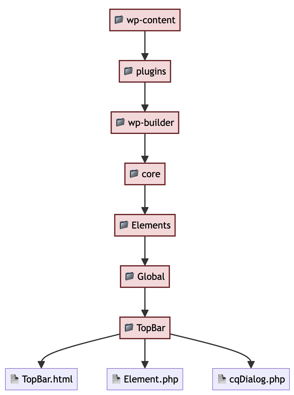
Composable PHP Components for WordPress
We are building this with PHP and WordPress, but the setup borrows ideas from how AEM works. If you know AEM, this layout will probably feel pretty familiar, even if the tech behind it is different.
Key similarities:
- Components → modular and reusable
- Dialogs → configurable UI fields
cqDialog.php≈cqDialog.xml
→ Uses ACF instead of Coral UIElement.php≈ Sling Model (Java)
→ Maps logic and data to components
Build Modular Interfaces
Like I showed earlier, topbar.html works on its own—it holds all the plain HTML, CSS, and JS so the CMS can just drop the component in and render it smoothly.
For example, topbar.php for the Topbar component.
<?php
if (isset($full_width) && isset($contact_information) && isset($business_hours) && isset($language_switchers)) {
    $topbar_classes = 'top-bar-cmp container';
    if ($full_width) {
        $topbar_classes = 'top-bar-cmp container-fullwidth';
    }
?>
<div class="top-bar-wrapper">
    <div class="<?=$topbar_classes?>" data-component="topbar">
        <ul class="top-bar-cmp__wrapper">
            <li class="top-bar-cmp__address">
                <?php echo esc_html($contact_information); ?>
            </li>
            <li class="top-bar-cmp__time">
                <?php echo esc_html($business_hours); ?>
            </li>
        </ul>
        <div class="top-bar-cmp__right">
            <!-- TODO -->
        </div>
    </div>
</div>
<?php } ?>Component-First Design
Every UI part works on its own—handling its structure, data, and how it appears. This makes updates easier and keeps things consistent.
The Element.php file is where data gets processed and the component gets displayed.
For example, Element.php for the Topbar component.
<?php

namespace Builder\Elements\Global\TopBar;

use Builder\Acf\Adapter;

/**
 * TopBar element for Builder
 */
class Element extends \Builder\Components\Element {

    /**
     * Set attributes
     */
    protected function attributes(): void
    {
        $this->title = __('Top Bar', 'builder');
        $this->description = __('Info line with contact, timing, locale, media links.', 'builder');
        $this->icon = 'window-maximize';
        $this->categorize = 'general';
        $this->field_group = Adapter::get_shiftsaas_key_group('top_bar');
    }

    /**
     * Output frontend view
     *
     * @param array $fields Field values
     */
    protected function frontend_view($fields): void
    {
        $processed_data = $this->process_data($fields);
        extract($processed_data);
        include dirname(__DIR__, 3) . '/Components/ShiftSaas/Global/topbar.php';
    }

    public static function process_data($fields): array
    {
        return [
            'contact_information' => !empty($fields['contact_information']) ? $fields['contact_information'] : __('234, Triumph St, Los Angeles, California, US.', 'builder'),
            'business_hours' => !empty($fields['business_hours']) ? $fields['business_hours'] : __('Mon - Sat: 9.00 am to 6.00 pm.', 'builder'),
            'link_facebook' => !empty($fields['link_facebook']) ? $fields['link_facebook'] : __('', 'builder'),
            'link_twitter' => !empty($fields['link_twitter']) ? $fields['link_twitter'] : __('', 'builder'),
            'link_linkedin' => !empty($fields['link_linkedin']) ? $fields['link_linkedin'] : __('', 'builder'),
            'link_vimeo' => !empty($fields['link_vimeo']) ? $fields['link_vimeo'] : __('', 'builder'),
            'link_skype' => !empty($fields['link_skype']) ? $fields['link_skype'] : __('', 'builder'),
            'language_switchers' => !empty($fields['language_switchers']) ? $fields['language_switchers'] : [],
            'full_width' => !empty($fields['full_width']) ? $fields['full_width'] : ''
        ];
    }

    /**
     * Output backend view
     *
     * @param array $fields Field values
     */
    protected function backend_view($fields): void
    {
        $component = $this->title;
        include dirname(__DIR__, 3) . '/Components/ShiftSaas/default.php';

        extract($fields);
        include dirname(__DIR__, 3) . '/Components/ShiftSaas/Global/topbar.php';
    }
}process_data() and extract() are used to retrieve all ACF fields, which are then passed into the cqDialog.php file for rendering.
Make It Editable
This is where we hook things up with ACF. In cqDialog.php, we set up all the fields—like contact info, hours, and socials—so content folks can fill them in without touching code. It is how we plug real data into the UI and keep things flexible for editing later on.
<?php

namespace Builder\Elements\Global\TopBar;

use Builder\Acf\Adapter;

/**
 * TopBar element for Builder
 */
class Element extends \Builder\Components\Element {

    /**
     * Set attributes
     */
    protected function attributes(): void
    {
        $this->title = __('Top Bar', 'builder');
        $this->description = __('Info line with contact, timing, locale, media links.', 'builder');
        $this->icon = 'window-maximize';
        $this->categorize = 'general';
        $this->field_group = Adapter::get_shiftsaas_key_group('top_bar');
    }

    /**
     * Output frontend view
     *
     * @param array $fields Field values
     */
    protected function frontend_view($fields): void
    {
        $processed_data = $this->process_data($fields);
        extract($processed_data);
        include dirname(__DIR__, 3) . '/Components/ShiftSaas/Global/topbar.php';
    }

    public static function process_data($fields): array
    {
        return [
            'contact_information' => !empty($fields['contact_information']) ? $fields['contact_information'] : __('234, Triumph St, Los Angeles, California, US.', 'builder'),
            'business_hours' => !empty($fields['business_hours']) ? $fields['business_hours'] : __('Mon - Sat: 9.00 am to 6.00 pm.', 'builder'),
            'link_facebook' => !empty($fields['link_facebook']) ? $fields['link_facebook'] : __('', 'builder'),
            'link_twitter' => !empty($fields['link_twitter']) ? $fields['link_twitter'] : __('', 'builder'),
            'link_linkedin' => !empty($fields['link_linkedin']) ? $fields['link_linkedin'] : __('', 'builder'),
            'link_vimeo' => !empty($fields['link_vimeo']) ? $fields['link_vimeo'] : __('', 'builder'),
            'link_skype' => !empty($fields['link_skype']) ? $fields['link_skype'] : __('', 'builder'),
            'language_switchers' => !empty($fields['language_switchers']) ? $fields['language_switchers'] : [],
            'full_width' => !empty($fields['full_width']) ? $fields['full_width'] : ''
        ];
    }

    /**
     * Output backend view
     *
     * @param array $fields Field values
     */
    protected function backend_view($fields): void
    {
        $component = $this->title;
        include dirname(__DIR__, 3) . '/Components/ShiftSaas/default.php';

        extract($fields);
        include dirname(__DIR__, 3) . '/Components/ShiftSaas/Global/topbar.php';
    }
}
process_data() and extract() are used to retrieve all ACF fields, which are then passed into the cqDialog.php file for rendering.
Wait for continuing…